Sophie Dallamore
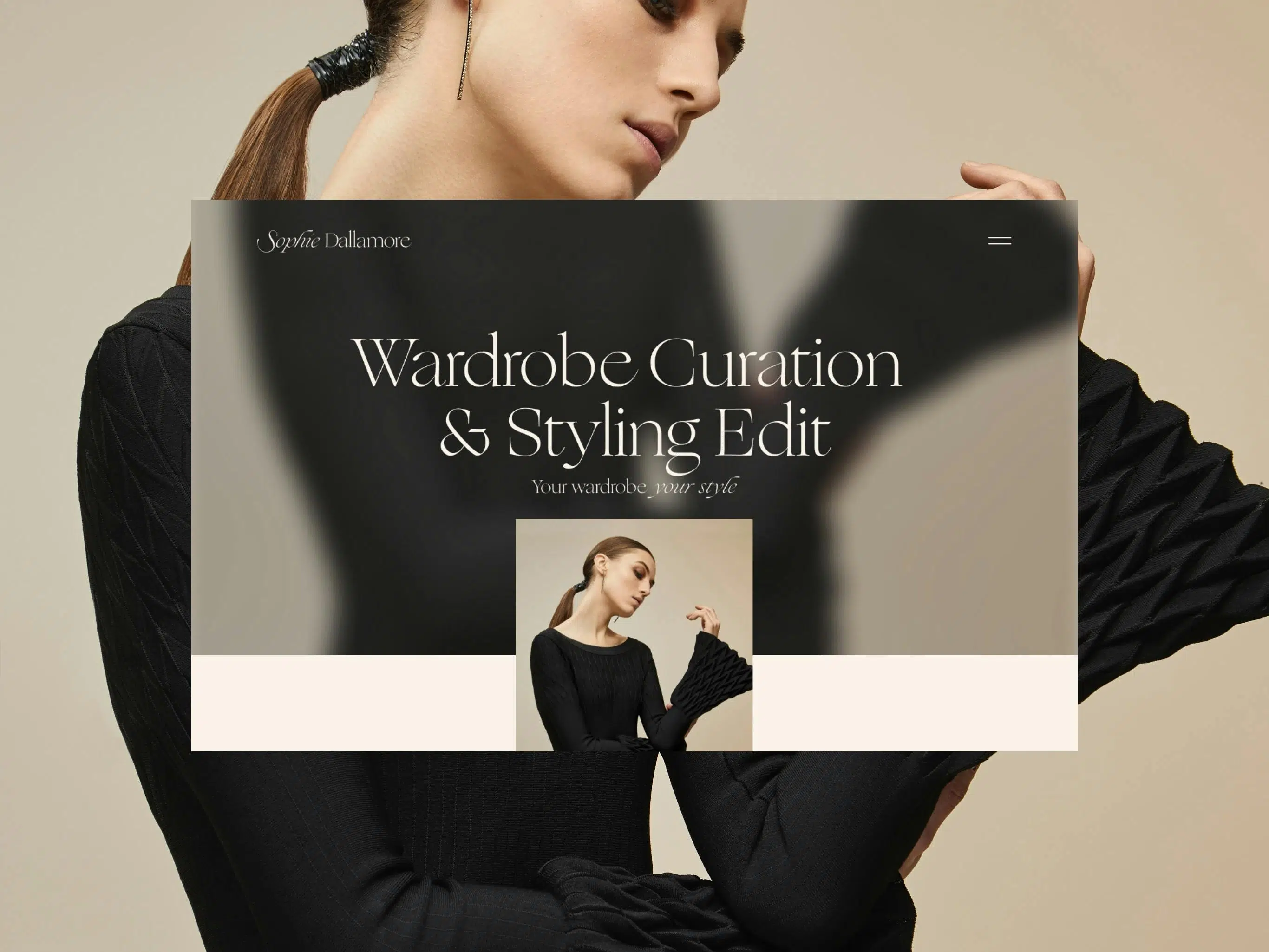
The brand identity and website needed to be a visual representation of who Sophie is, while adding long-term value to her business and connecting her with her audience.
The design strategy was to tell Sophie’s story, showcase her strengths and capabilities, and grow her client base. We wanted the collateral to be a celebration of Sophie, capturing the essence of her values and who she is - in tandem with the industry and her ode to clothing.
It was important to retain authenticity and create a true connection with potential clients by translating Sophie’s personality into the brand's identity.
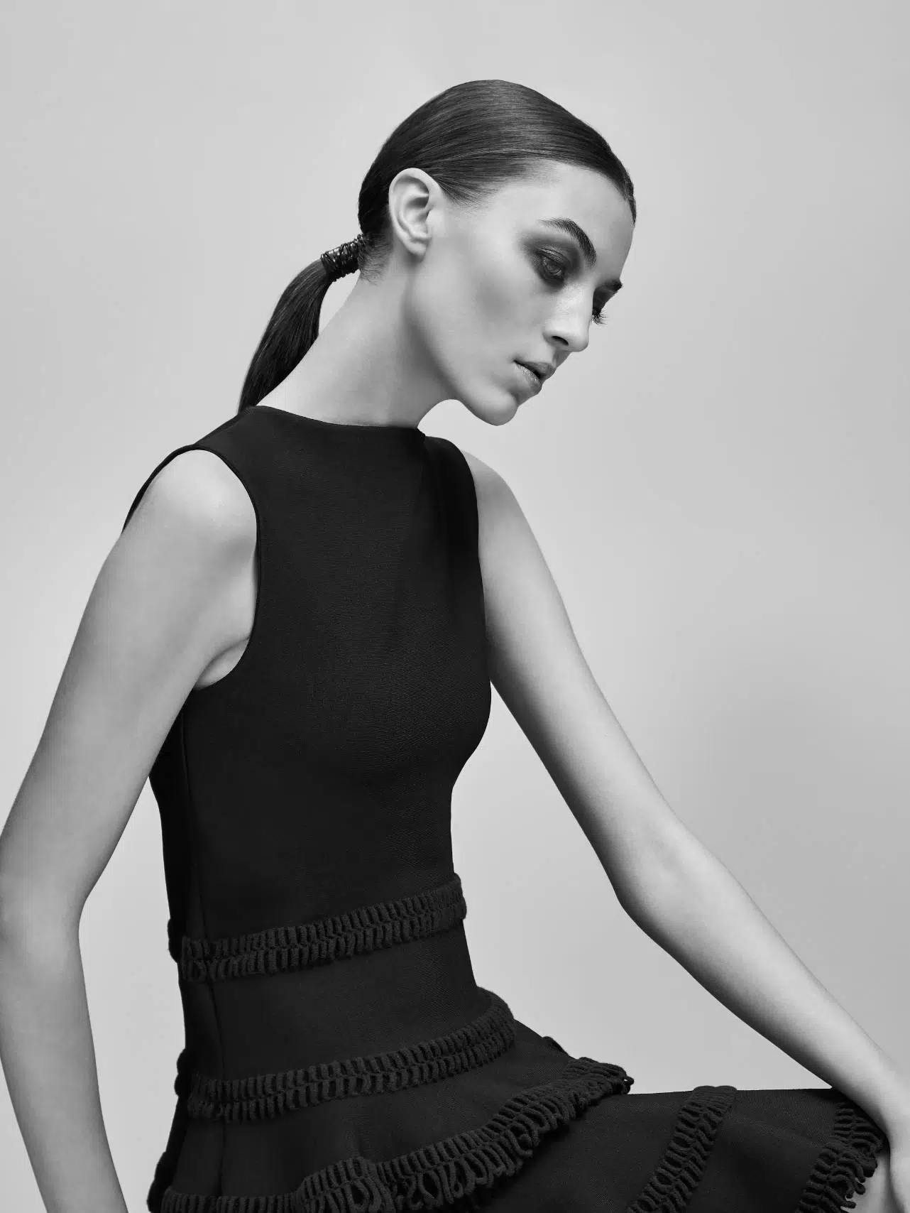
“We don’t need to reject our femininity to bestrong or powerful and, as is always the way, what we wear reflects our evolved attitudes.”
We drew inspiration from Sophie’s personal characteristics as well as from a quote by Ella Alexander from Harper’s Bazaar. This led us to the concept of ‘Soft Power’ - the embodiment of femininity and the power it holds.
The result is a quietly confident and sophisticated typographic design language, exuding beauty and strength in its simplicity.
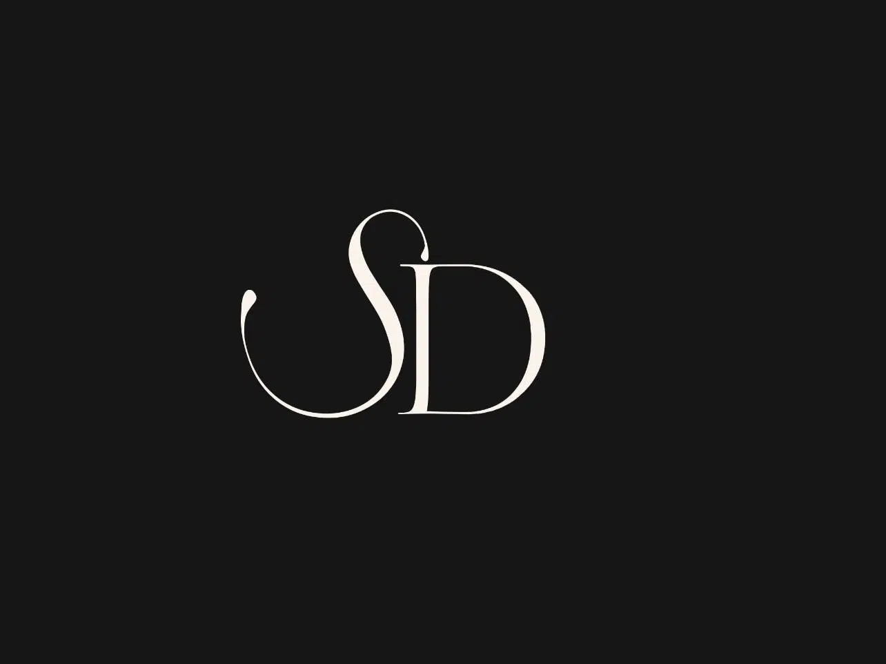
The wordmark was altered and modified from the brand’s primary typeface - Ogg. We leveraged the font’s typographic characteristics to pay homage to the luxurious lettering synonymous with the fashion industry.
Reflecting the concept of ‘Soft Power,’ the effortless blending of text style and sharp edges within the logotype provides elegance and editorial expression to the design.
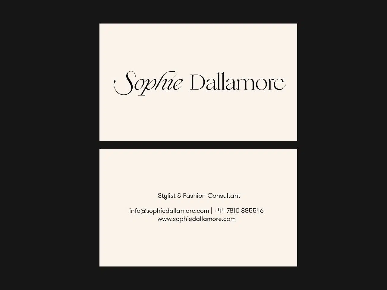
Across the brand’s applications, the wordmark adds a permanence to whatever it touches. It reveals the beauty in simplicity and an unmistakable timelessness - effortlessly implemented in response to the application’s size, shape and function.
The design system expanded to complement the brand - thriving in simplicity and subtle interactions. The design is teeming with character, whilst maintaining a utility and rigour necessary to carry the full weight of the identity across all its touch points.
Supporting the striking typographic execution of the wordmark, we opted for GT Walsheim Pro as a secondary typeface. The geometric characteristics of the typeface complements the precise and systematic nature of the identity, alongside a sincerity firmly rooted in the brand's tone.
Together, the two allow the identity to effortlessly adapt from composition to composition, enabling the brand to convey the splendour of fashion itself; radiating luxury while simultaneously celebrating the identity’s favour of subtlety over excess.
Scope of work
Research
- Customer Research
- Trends Analysis
- Competitor Review
- Usability Research & Testing
- Market Research
Strategy
- Brand Positioning & Architecture
- Target Audience Discovery
- Information Architecture
Design
- Art Direction
- Brand Identity Design
- Graphic Design
- User Interface Design
- User Experience Design
- Interaction Design
- Motion Design
- Design Systems
- Quality Assurance
Development
- Technical Strategy
- Webflow Development
- Cross-browser Testing
- Cross-device Testing
- SEO & Performance Optimisation
- Quality Assurance
Content
- SEO Copy Analysis & Refinement
- Social Media Design