Why Strong Brand Identity Is Important in Web Design
In today’s digitally led world, many would say that websites are a dime a dozen. And they aren’t wrong, websites are everywhere and every business big and small seems to have one. But in the same breath, most people would agree that not all websites are created equal and there are certainly ones that stand out from the crowded web and find their way into our memories.
So, what sets a mediocre website apart from a great one? The answer isn’t just a good designer – a good brand identity is just as important.
“A brand’s identity needs to be the visual, emotional and psychological depiction of your company’s values,” says Rogan Jansen, co-founder and creative director at DashDigital, “and in order for your website to succeed, this needs to filter through in its design, ensuring the user walks away knowing what your company stands for and who it is.”
— Rogan Jansen | Co-Founder & Creative Director
It’s no secret that brands with a strong personality are by far the most memorable. And this has never been more crucial, bearing in mind how competitive the internet is and the fact that most customers’ first impressions of a company or brand live or die based on their website. A brand’s reputation is immediately elevated when its website not only looks good but matches the brand’s identity and actually demonstrates why it exists. And it’s all of this that helps visitors leave with memorable experiences, which ultimately leads to trust in the brand.
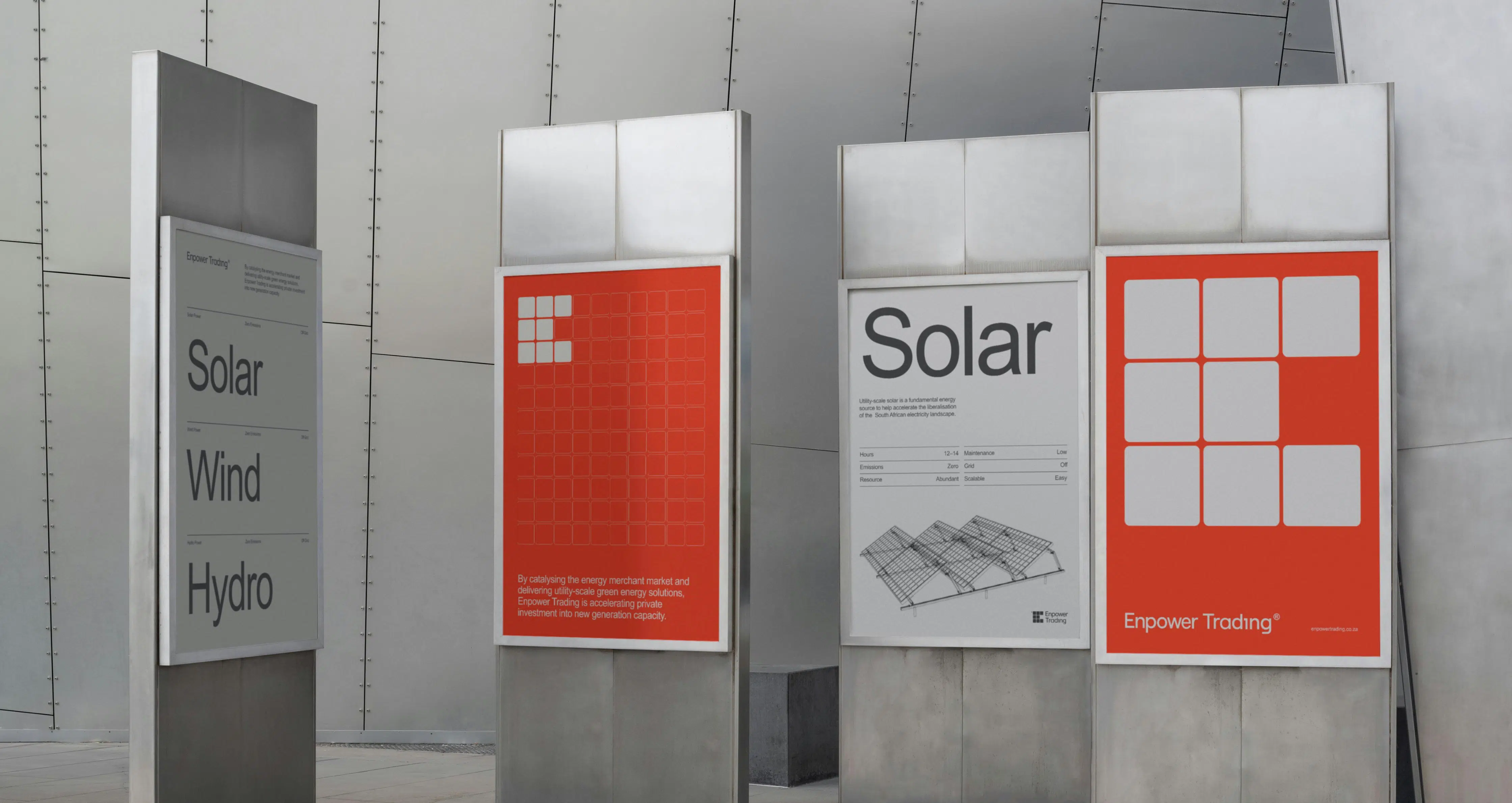
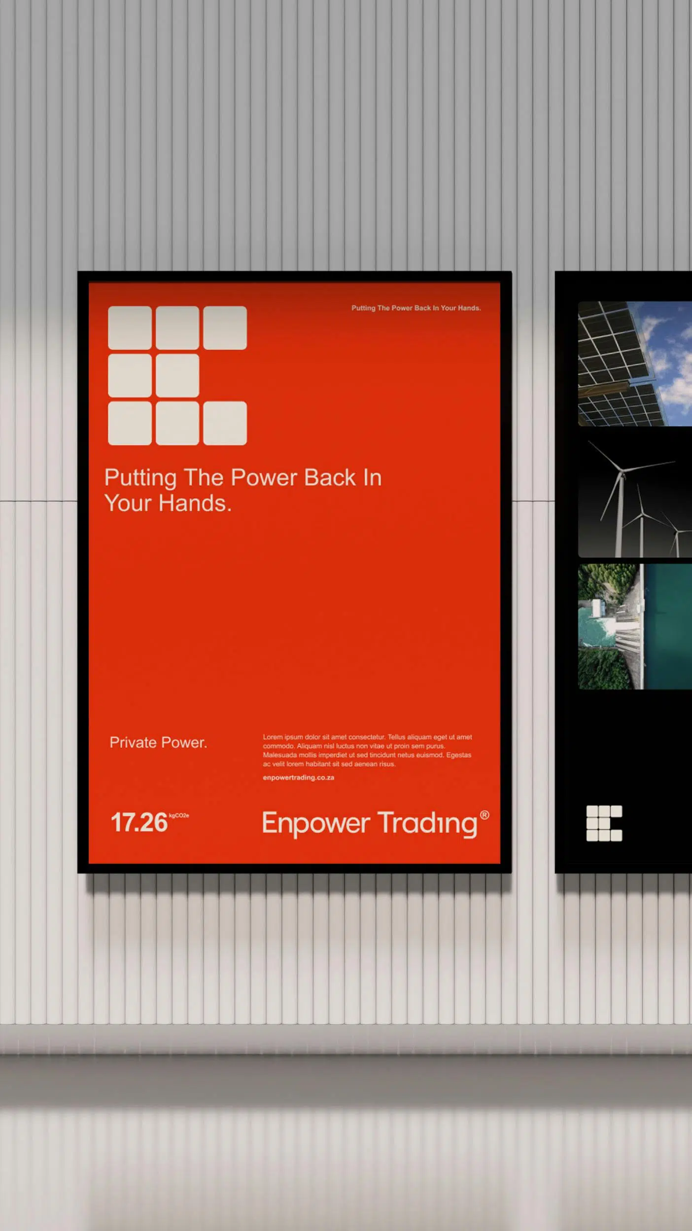
Working together with their client Enpower Trading, DashDigital recently had the opportunity to masterfully bring the energy trader’s brand vision to life through design and functionality closely aligned to their values and long-term impact on the energy market at large.
“The website is a perfect example of a concept-driven approach where every decision made was done so with purpose,” explains Jansen, “and where no element included was added without serving the overarching vision.”
Enpower Trading is a brand committed to transforming the African energy sector with innovation and sustainable solutions – and it was crucial that their website’s visual identity reflected this mission. Embracing minimalism and harnessing the potential of eco design principles, Enpower Trading and DashDigital settled on Arial as the font for the website. As a widely used sans-serif typeface, Arial is well known as a more sustainable font as it uses less resources, less storage space and ultimately has a lesser carbon footprint.
“But it’s not only the font that we considered carefully. Embracing a comprehensive 3D approach would have also demanded excessive power,” explains Jansen, “so it was decided that we would explore alternatives aimed at reducing the additional burden associated with full 3D implementation. This included shaders, large file sizes and prolonged load speeds.”
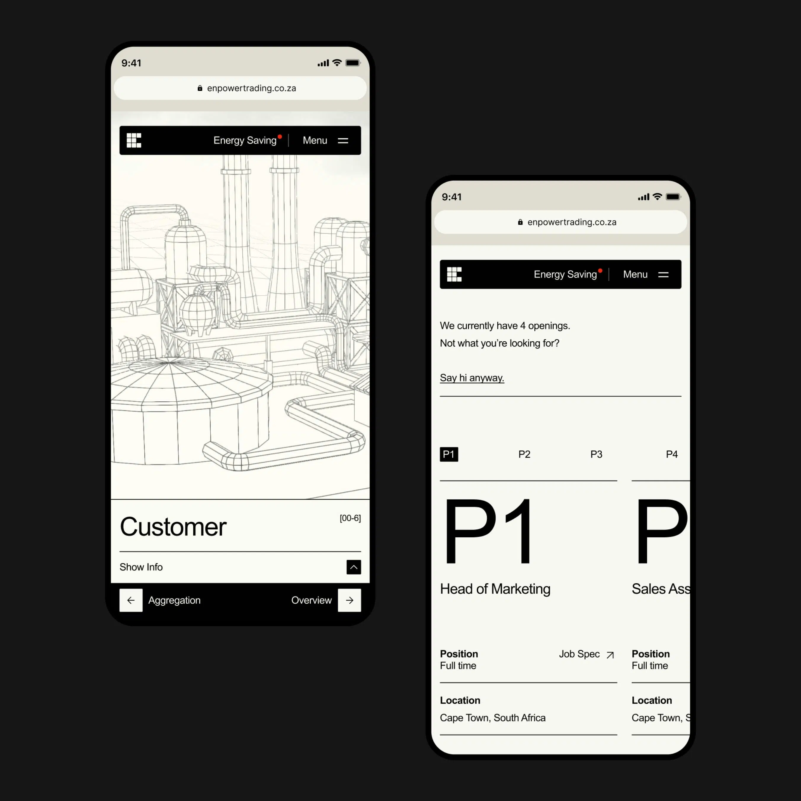
The chosen approach involved downsizing the 3D elements and presenting a more streamlined wireframe appearance in black and white. This minimalist aesthetic focused on individual power sources, utilising colour to draw attention, all the while operating in the background with significantly reduced energy consumption.
“To further enhance energy efficiency,” elaborates Jansen, “a customised energy-saving model was developed. This model empowers users by providing the ability to toggle various features like animations as well as light and dark modes. Each adjustment contributes to an energy-saving score, graded as A, B, C, or D through an algorithm. This score serves as an indicator of the current energy consumption while navigating the website.”
From a branding perspective, Enpower Trading’s visual identity revolves around sustainability and energy-saving across all aspects. To ensure this seamless continuation, the DashDigital team imposed strict file limits for the website journey, ensuring the entire site remained as compact as possible.
“In each design decision, our primary objective was to inform users, while maintaining a delicate balance between conciseness and engagement. Striking this balance prevented the risk of losing user interest due to an overly simplified site or overwhelming it with excessive interactions or unnecessary elements. And the final result – a product that we are delighted with.”

The Benefits of Aligning Your Team with Your Business Objectives

Dream of Running Your Own Design Studio? Here’s What You Should Know

Designing for the Future – What It Means for 2024 and Beyond
