Enpower

- 1X Loeries Grand Prix
- 1X Loeries Gold
- 5X Loeries Nomination
- -
- FWA Site of the Day
- Awwwards Site of the Day
- Awwwards Developer Award
- CSS Site of the Year nomination
- CSS Site of the month
- CSS Site of the Day
- Muzli Features
Enpower Trading aspired to reshape the African energy sector with innovative, sustainable solutions. However, the challenge lay in crafting a brand that not only reflected this commitment but also embraced eco-friendly principles and communicated the brand's long-term impact effectively.
Enpower Trading sought to educate users on renewable energy and showcase its innovative solutions through an interactive digital platform. The challenge was to strike a balance between providing informative content and engaging user experiences while minimising energy consumption.
To address this challenge, we meticulously crafted a visual identity for Enpower Trading that embodies sustainability and innovation, drawing inspiration from minimalist and eco-design principles. Every design decision was carefully considered to reflect their commitment to environmental issues in South Africa.
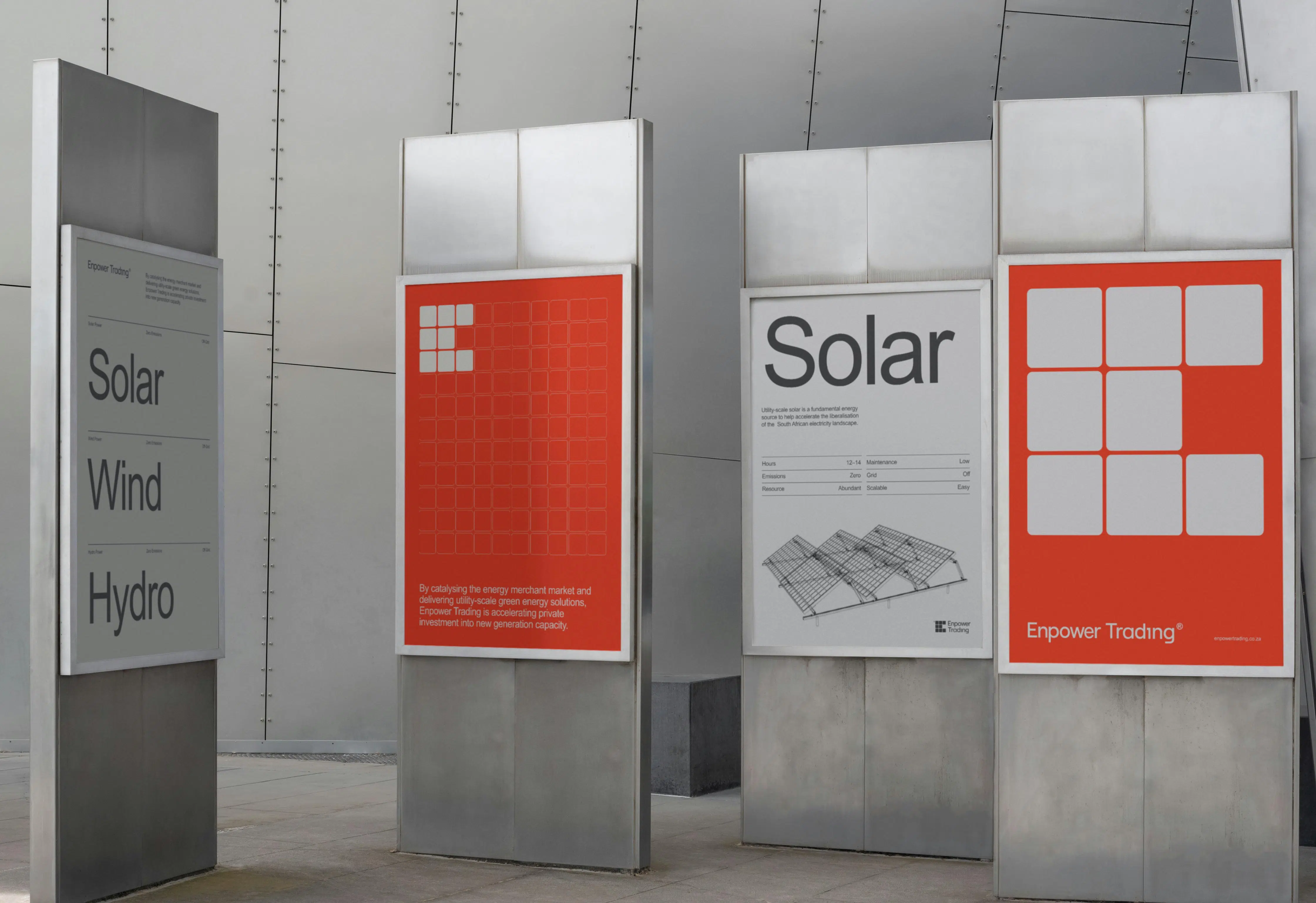
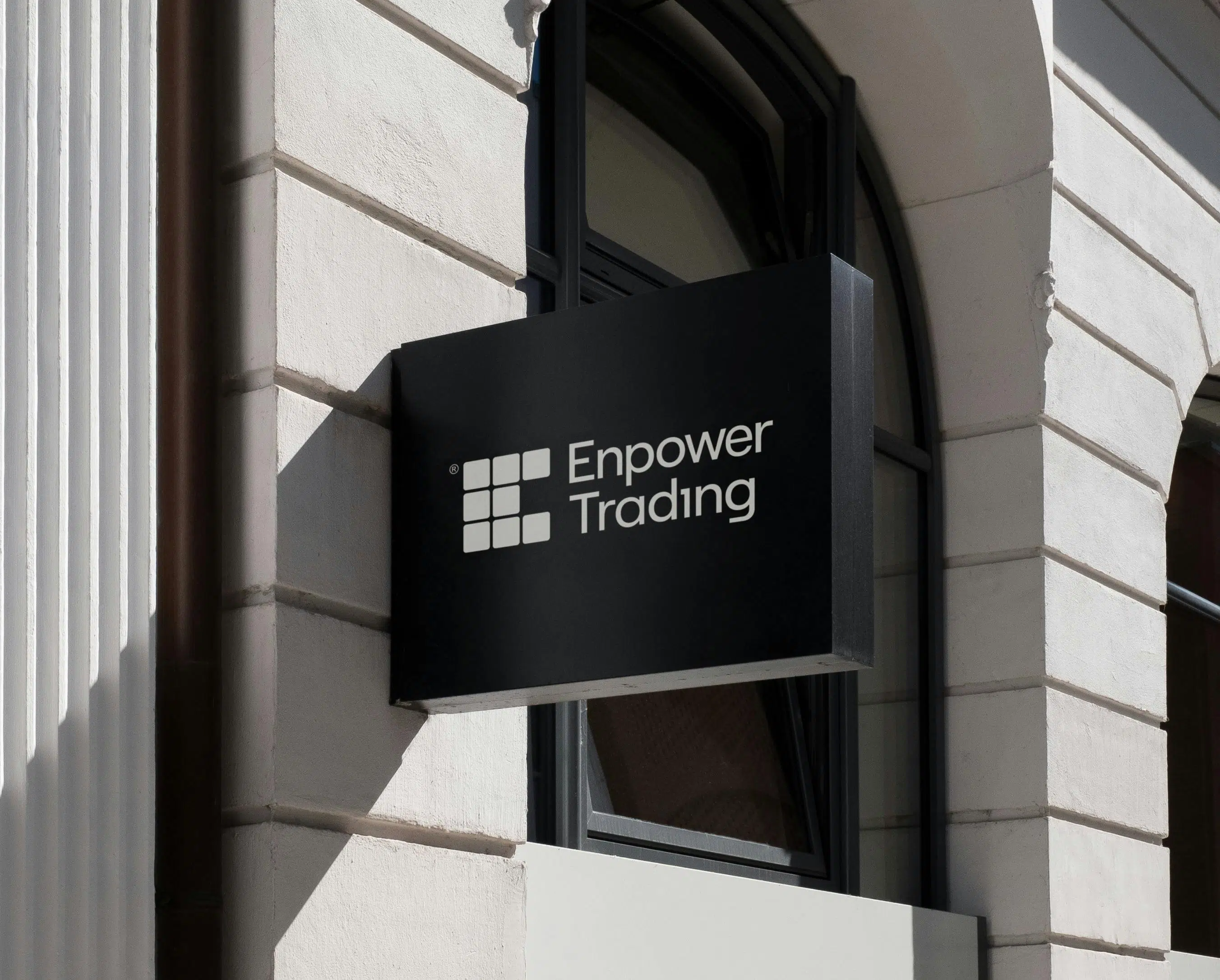
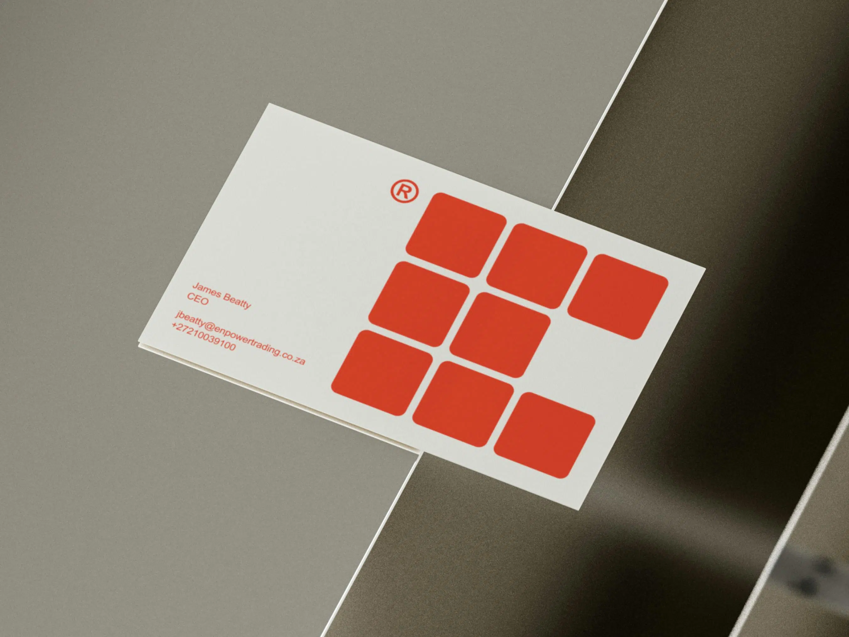
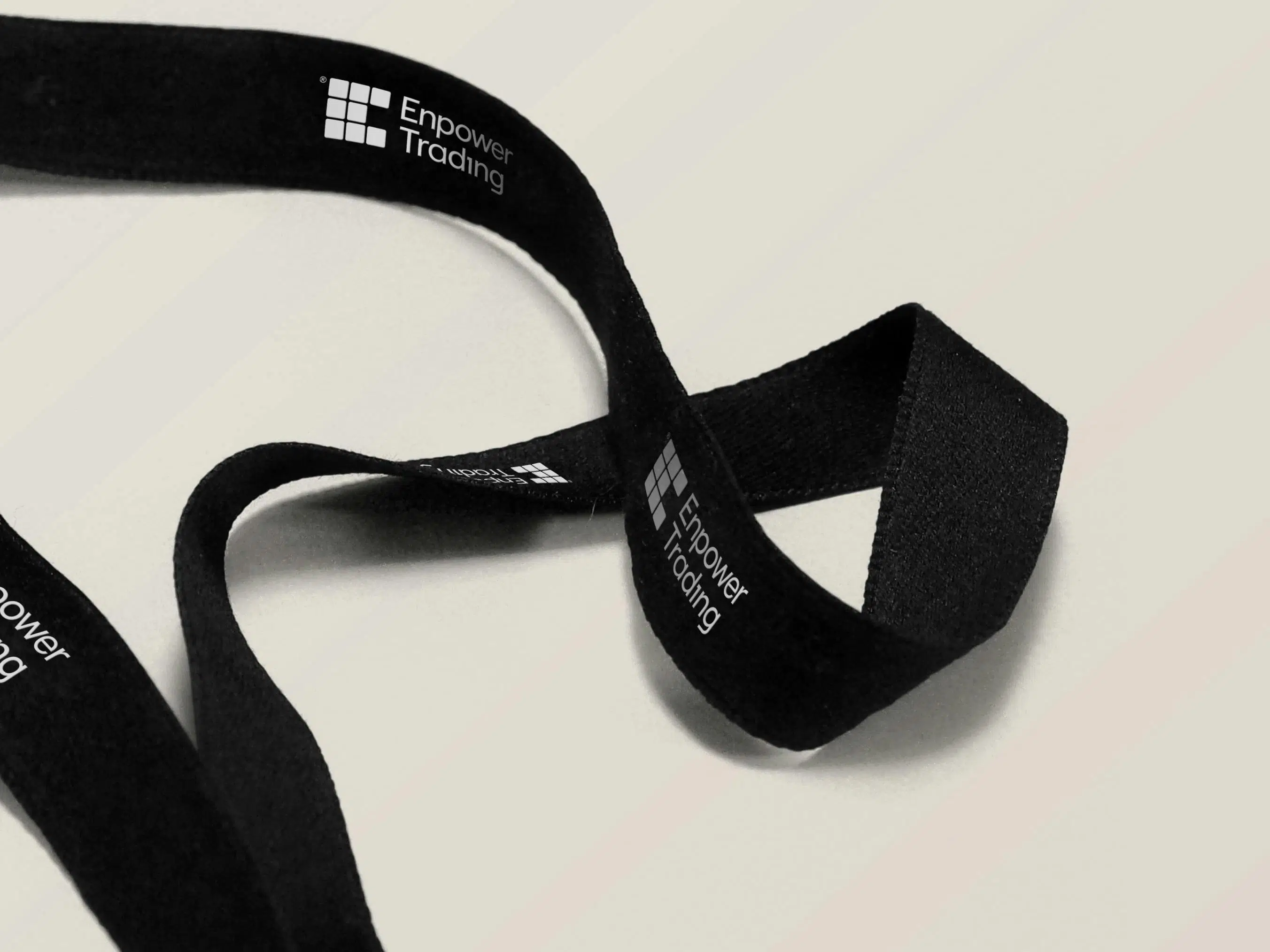
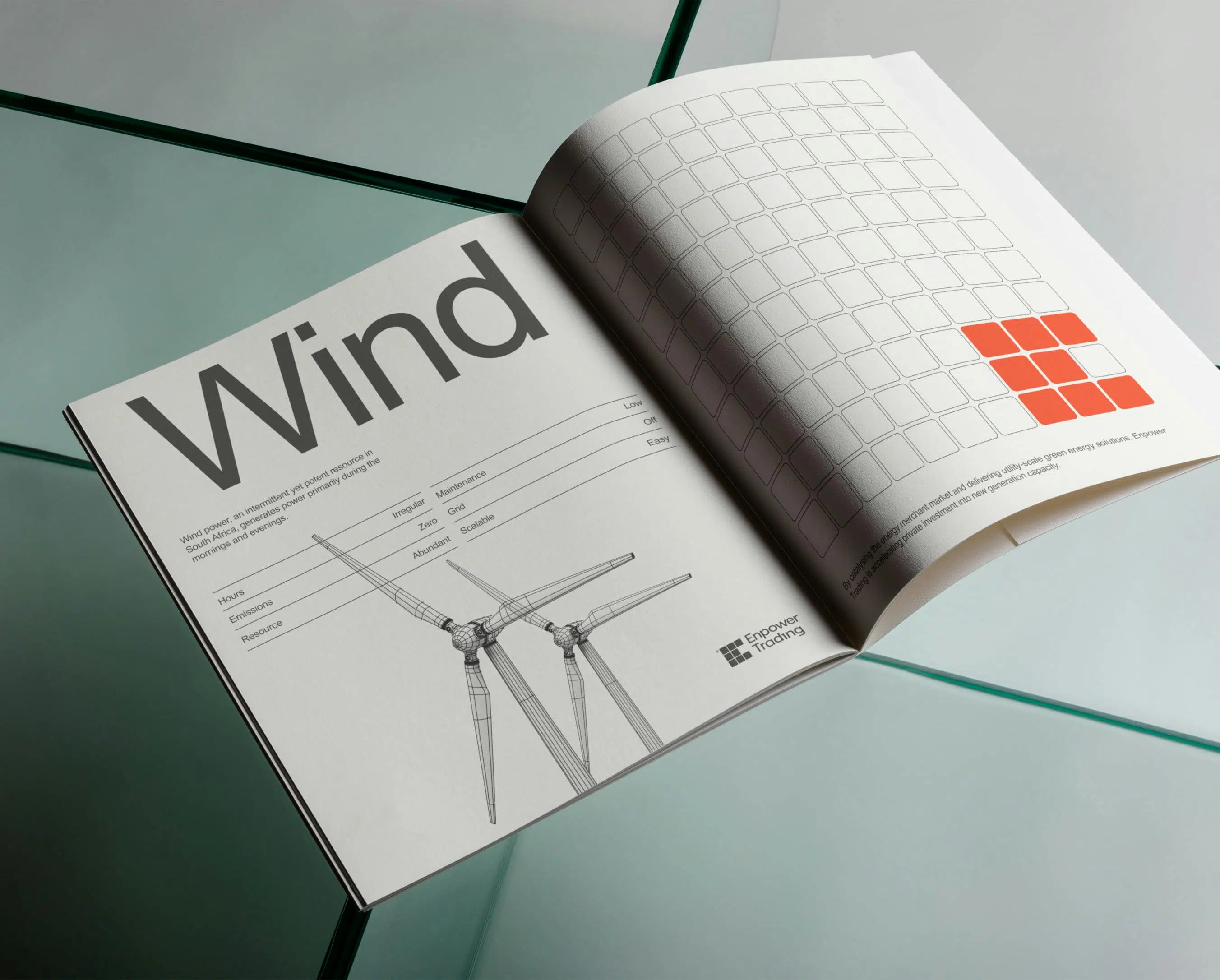
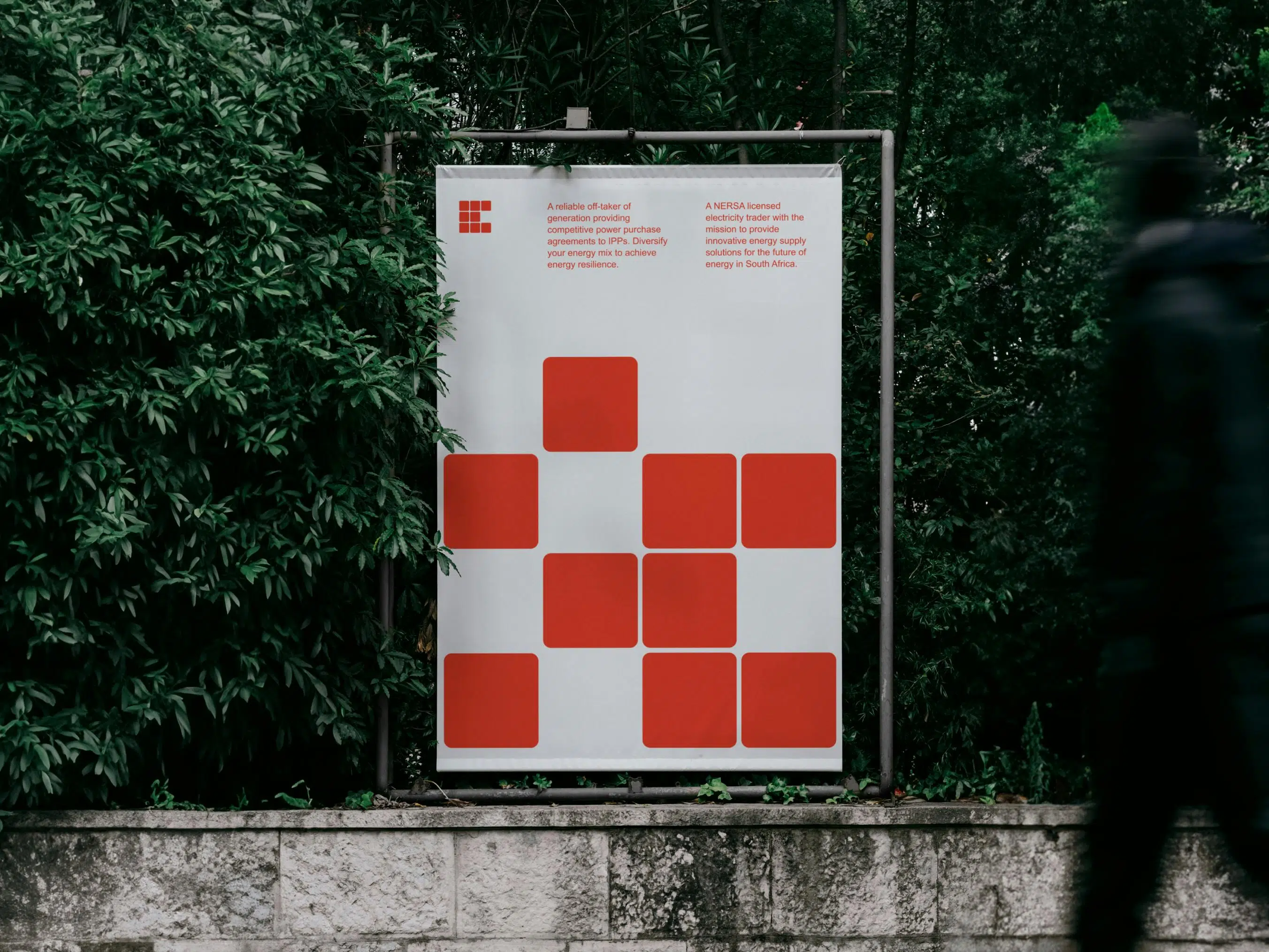
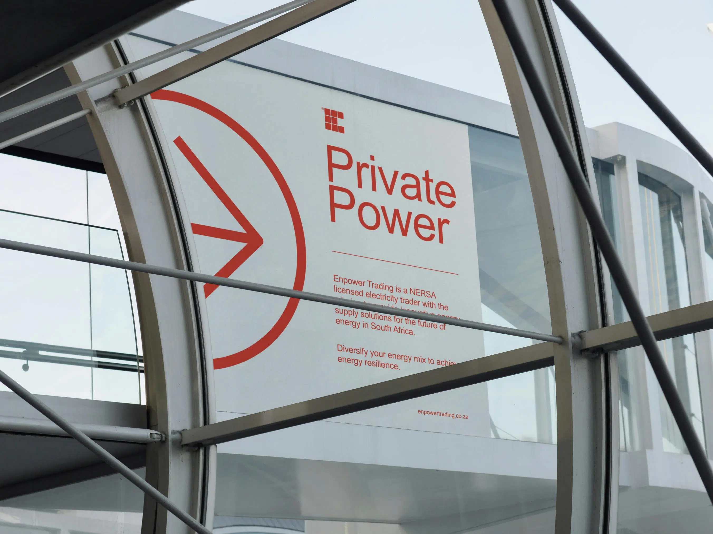
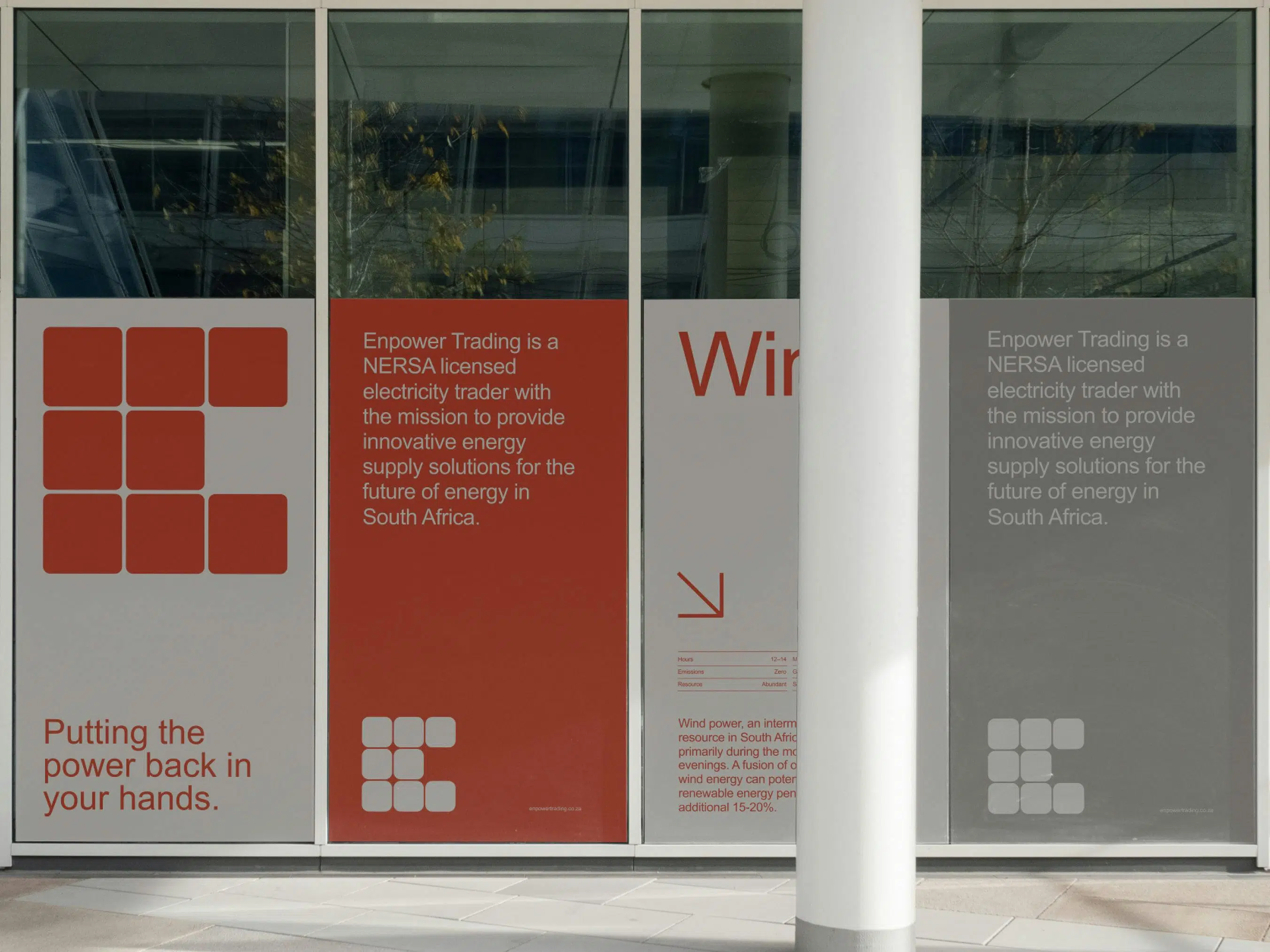
The logo and grid system, inspired by solar panel grids, symbolises interconnectedness and embodies sustainability, innovation, and credibility.
Our visual identity reflects a mission, embracing minimalism and eco-design principles for a sustainable, forward-thinking approach. We prioritise eco-friendly design, focusing on fonts, colour palettes, using recycled materials and plant-based inks to reinforce our environmental commitment.
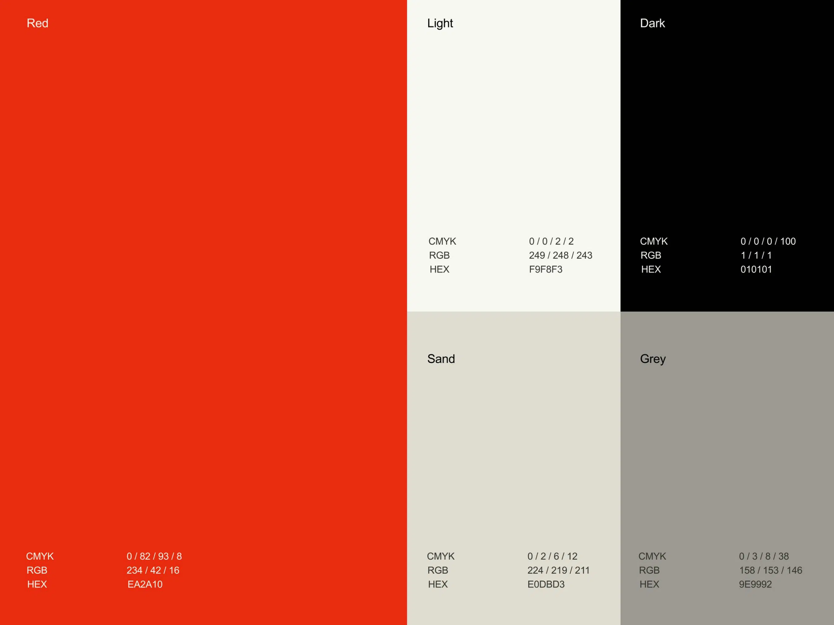
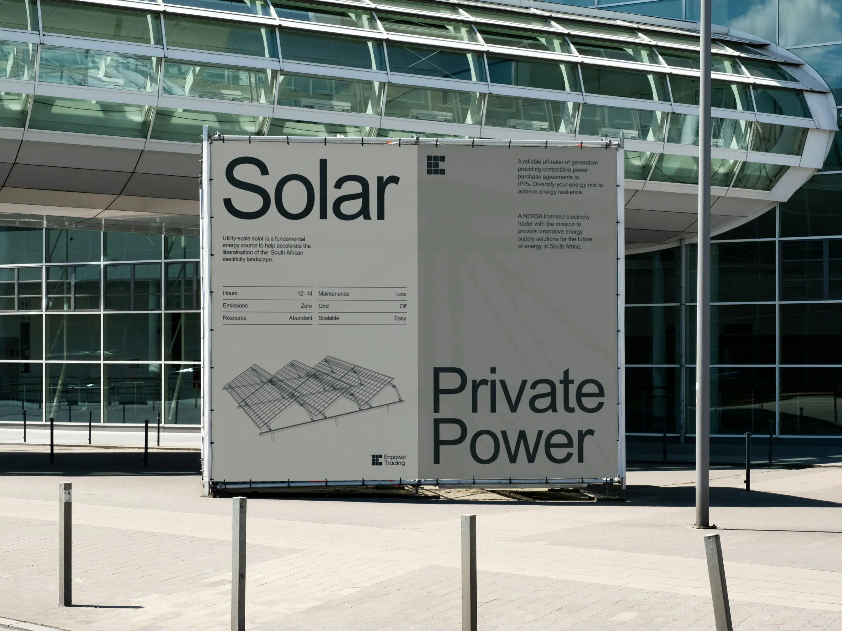
Our brand colours are not just visually appealing but environmentally conscious, with a light and dark theme inspired by electricity issues. Monochrome backgrounds are energy-efficient, saving up to 10% of total energy. We chose vibrant red to represent energy and forward-thinking.
We use the Arial font for efficiency, as it’s a system font on both Mac and Microsoft, reducing energy and storage demands. This sans-serif font also speeds up printing, reducing the carbon footprint.
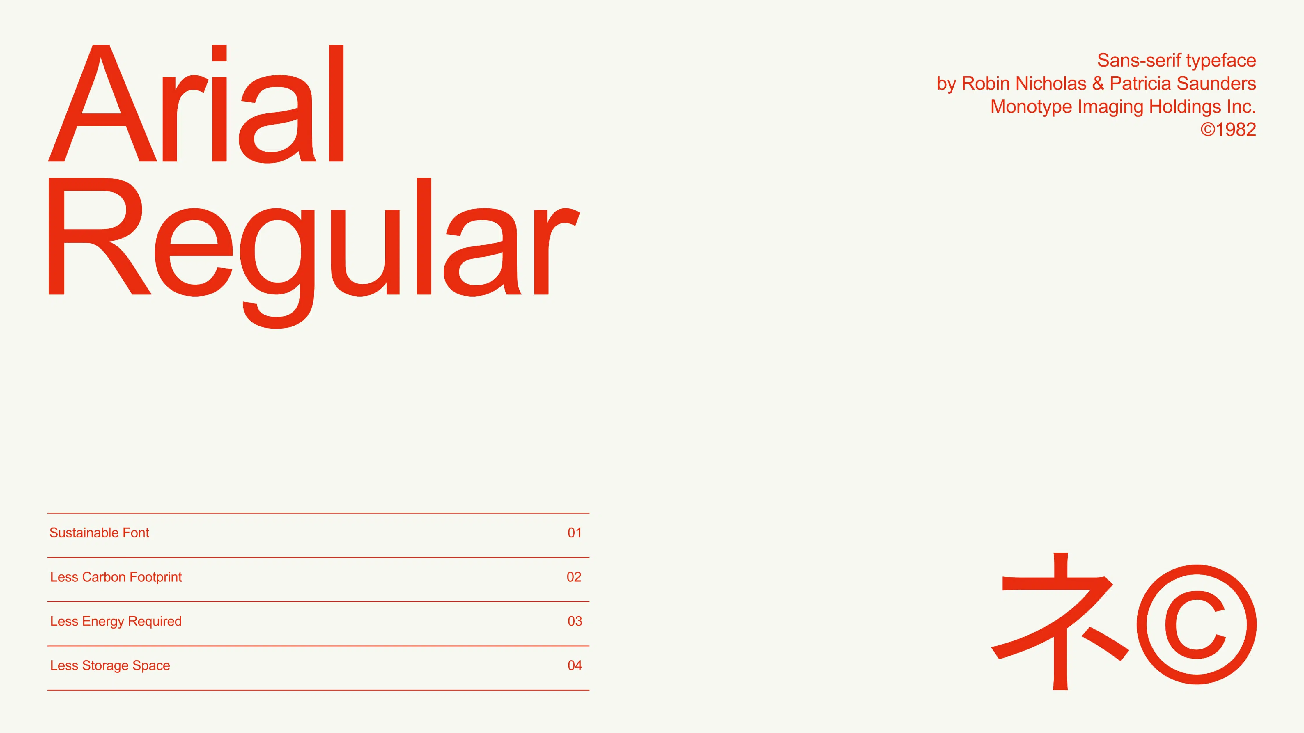
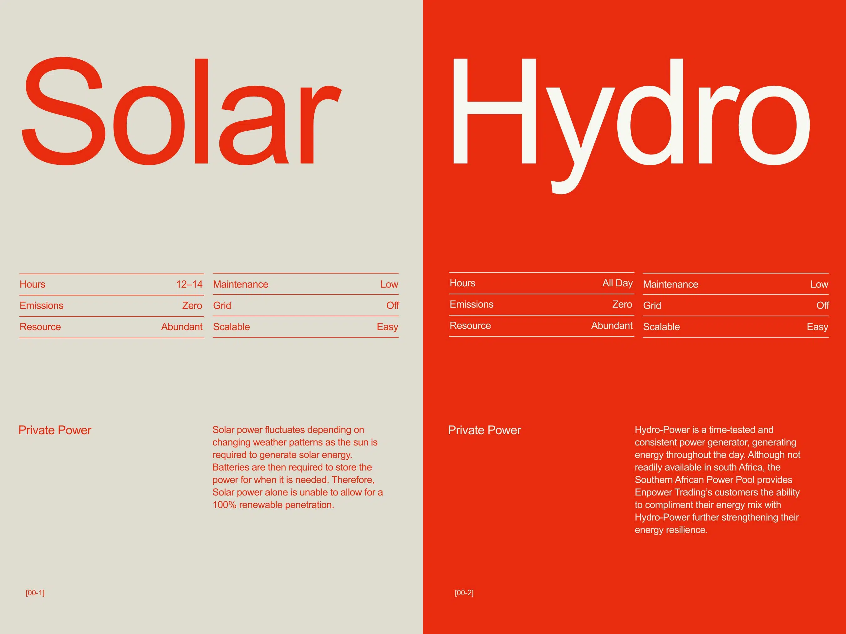
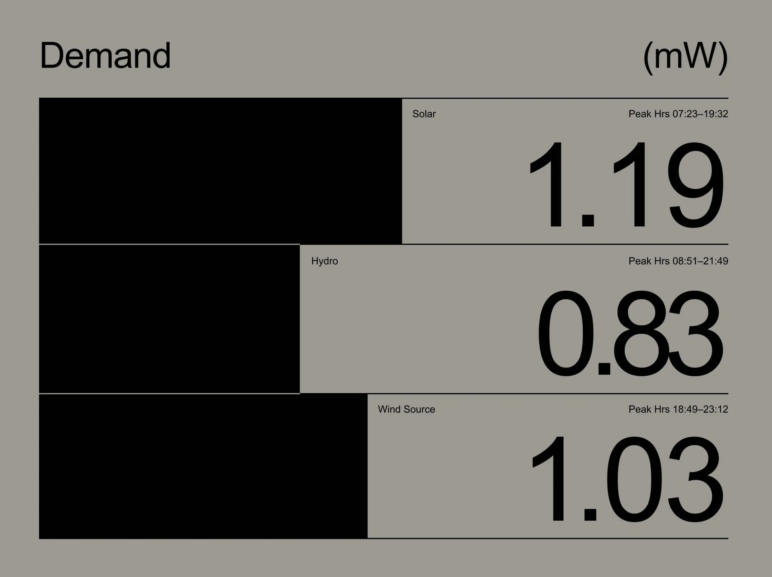
Through consistent use of the Arial font, Enpower Trading ensures readability and brand recognition across various platforms while prioritising legibility and hierarchy to guide users effectively through their content. Enpower Trading crafts engaging and impactful user experiences by utilising simple but bold graphs and graphics instead of traditional imagery, enhancing the minimalist aesthetic of their layouts. This approach aligns with their commitment to innovation and simplicity in design.
Bridging the Brand to Digital Frontiers and Energising Enpower Trading's Online Presence
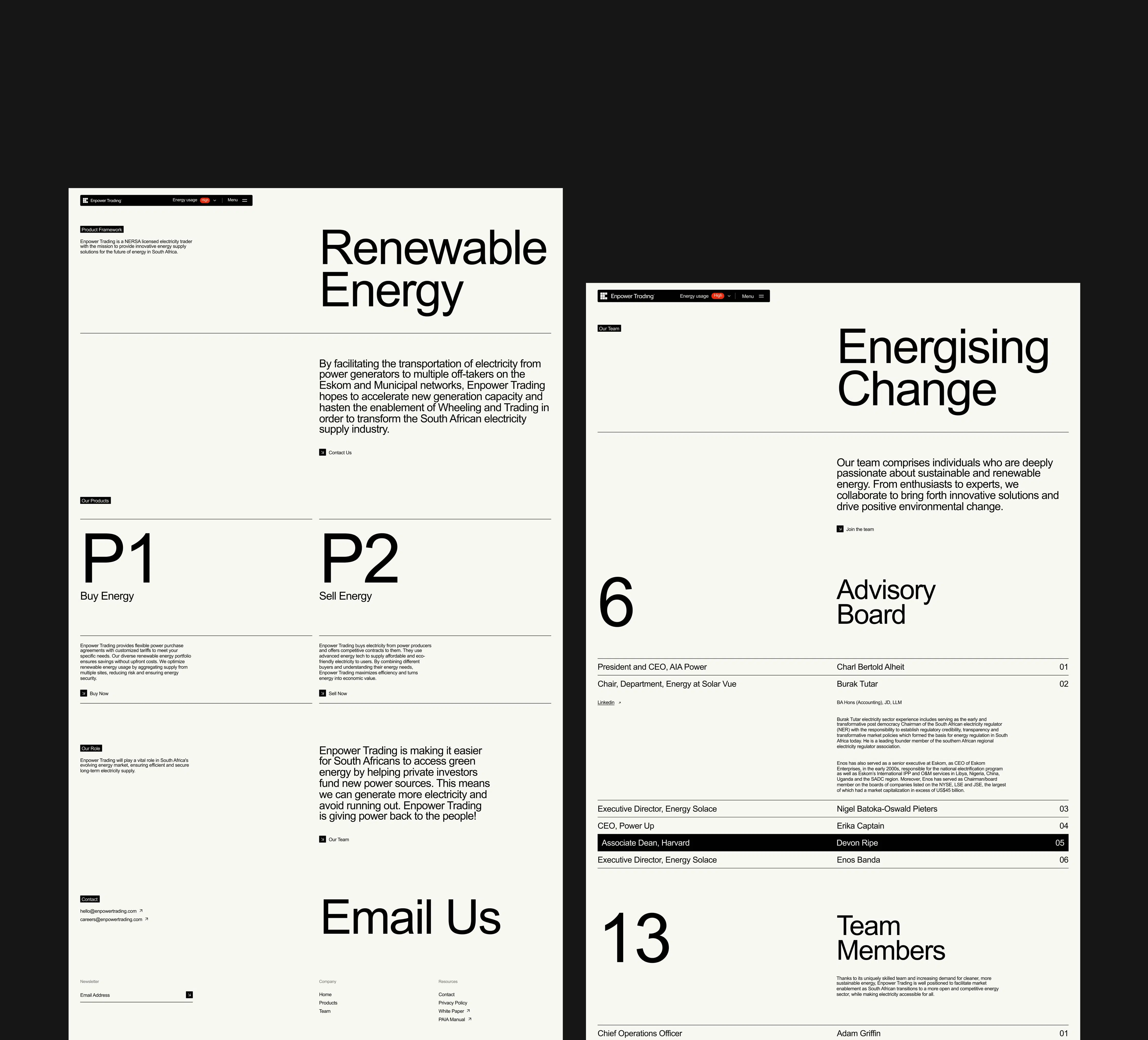
By striking a balance between conciseness and engagement, Enpower Trading created an interactive platform that effectively educates users on renewable energy sources without overwhelming them with unnecessary elements or excessive interactions.
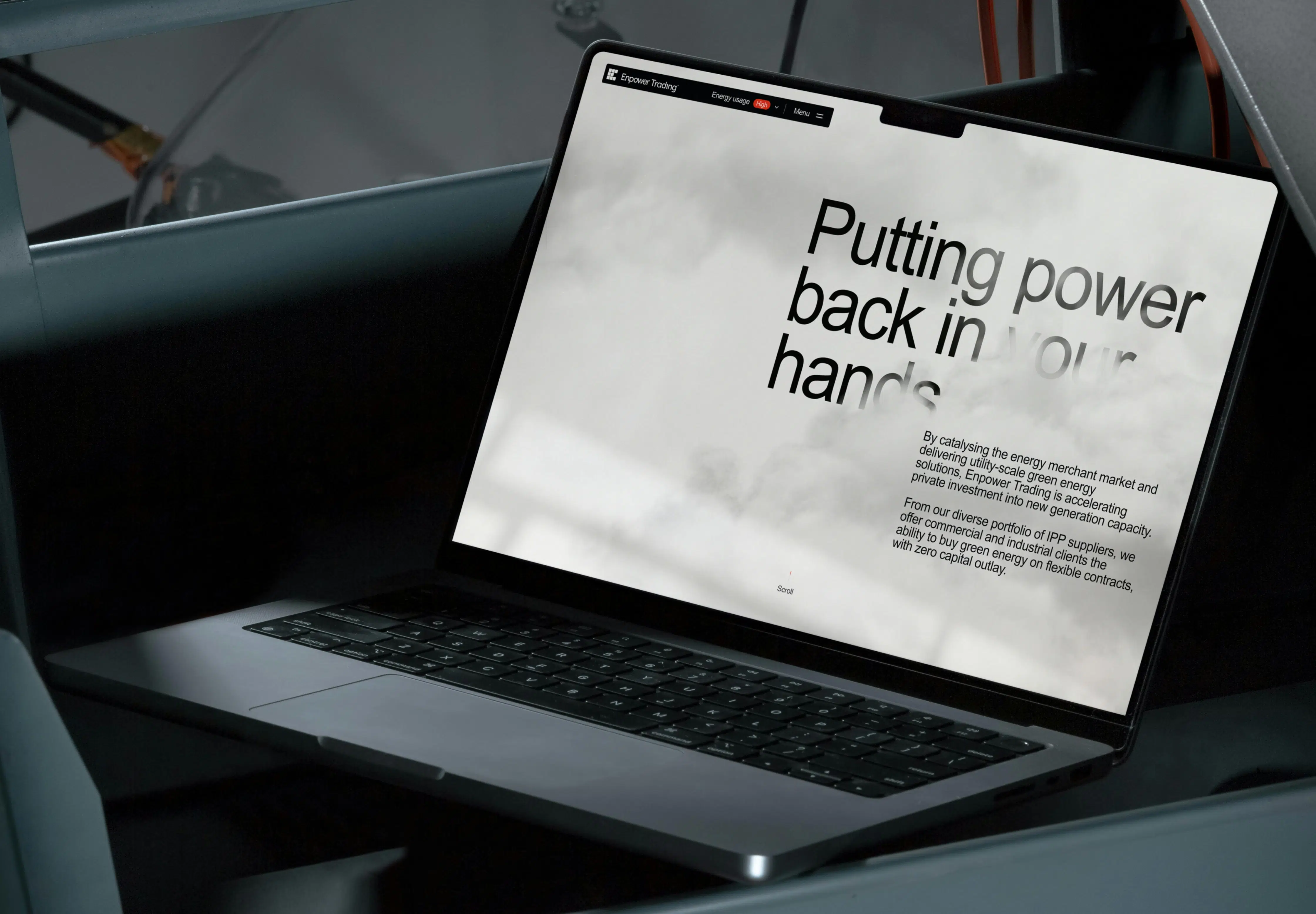
Recognising that a full-fledged 3D approach would consume excessive power, we opted for a streamlined approach, focusing on the core components. This led us to embrace a wireframe strategy that minimised the use of shaders and energy for rendering.
We imposed strict file size limits for the website journey, ensuring the entire site remained as compact as possible. In each design decision, our primary objective was to inform users while maintaining a delicate balance between conciseness and engagement. Striking this balance prevented the risk of losing user interest due to an overly simplified site or overwhelming it with excessive interactions and unnecessary elements.
We developed a custom energy-saving model integrated into the website's navigation, empowering users to toggle various features and visualise the energy impact of their decisions in real-time. By quantifying these decisions with an algorithm, users can easily monitor emulated CPU and GPU usage as they navigate the site, aligning with our brand's ethos of putting power back in the user's hands. This approach not only empowers users to make informed choices but also minimises energy consumption without sacrificing interactivity or engagement through efficient navigation and streamlined design.
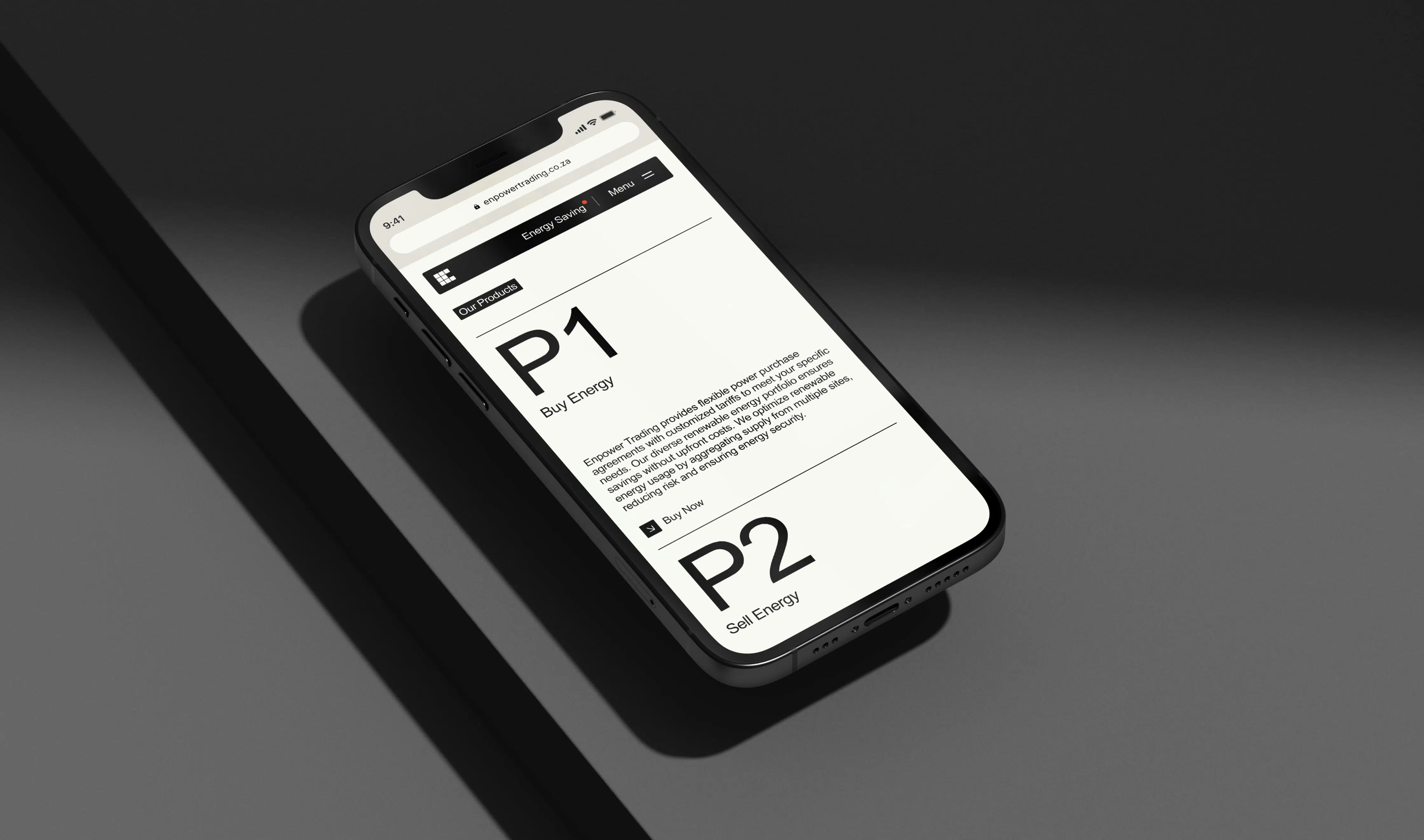
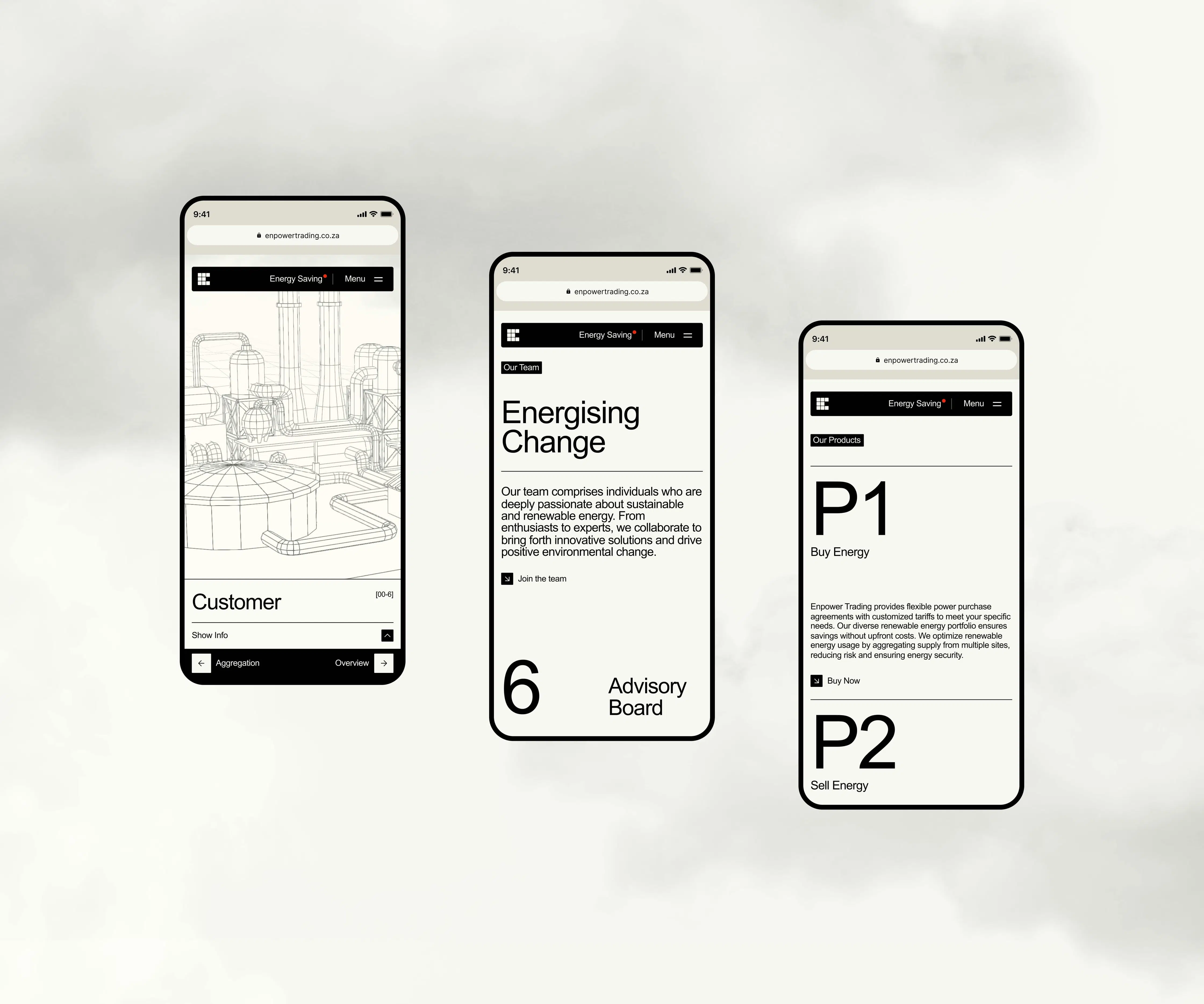
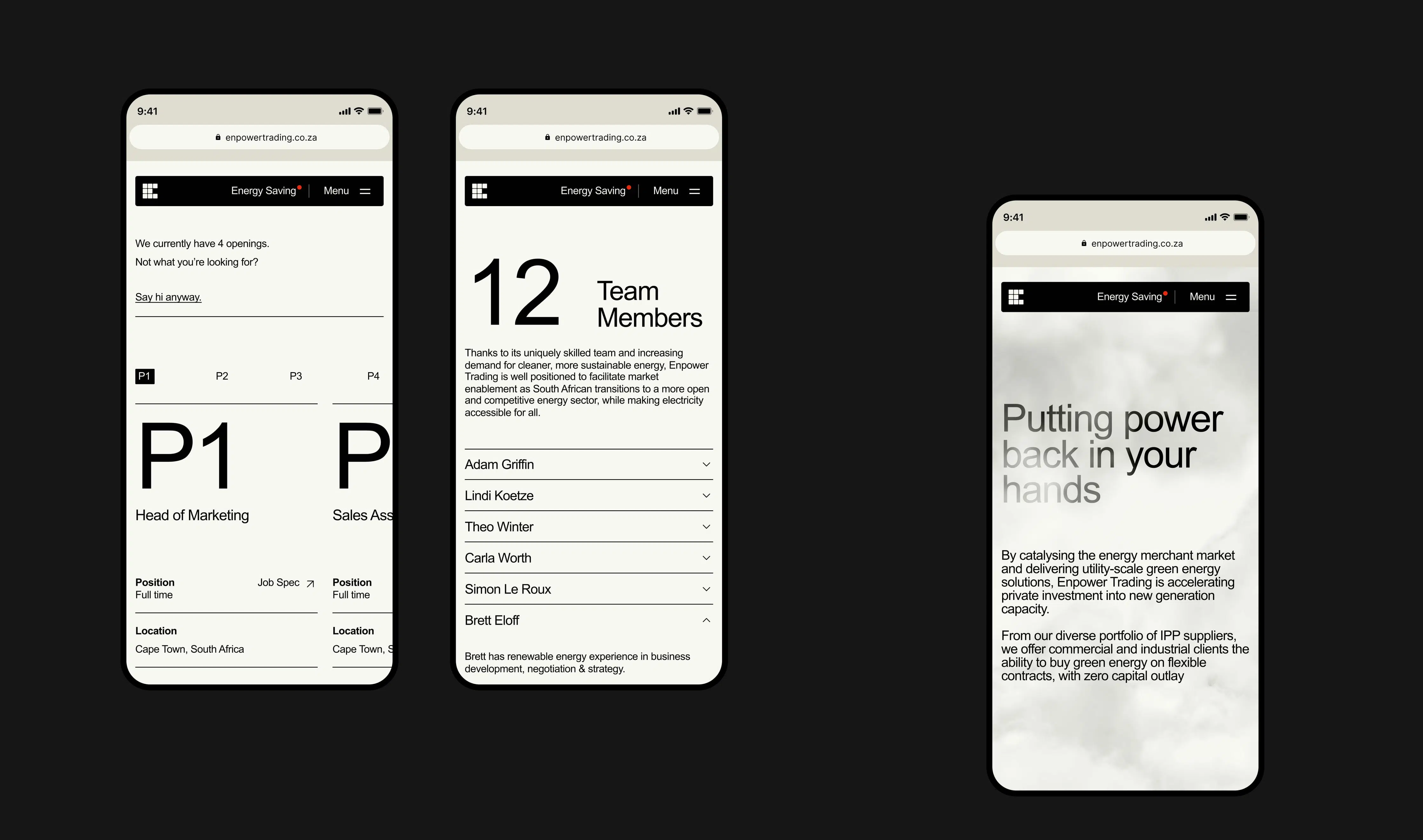
Scope of work
Research
- Competitor Review
- Best Practice Review
- Usability Research & Testing
- Market Research
Strategy
- Brand Positioning & Architecture
- Feature Definition
- Information Architecture
- Usability Audit & Review
Design
- Art Direction
- Brand Identity Design
- Design Systems
- Graphic Design
- User Interface Design
- User Experience Design
- Interaction Design
- 3D Design
- Motion Design
Development
- Technical Strategy
- Technical Consulting
- CMS Implementation
- React / Next.js Development
- WebGL / 3D Development
- Cross-browser Testing
- Cross-device Testing
- SEO & Performance Optimisation
- Quality Assurance
