VANA

In recent years, meditation and mindfulness have broken into the mainstream. As a result, alternative healthcare is fast becoming a pillar of the wellness industry. The challenge was to create a unique brand that demands recognition in a saturated market, and confidently stands apart from competitors in look and feel as well as tonality. The design needed to push the boundaries of what is expected in this industry, while still retaining approachability and appeal.
Both the brand strategy and the look and feel were developed in line with the main business objective: to set VANA apart from its competitors with a brand aesthetic that is bold, energetic, inclusive and non-judgemental. VANA is for every individual. And finding your VANA is your own personal journey.
The resulting identity is rooted in the concept of breathing, using gradients and expressive typography to explore the interconnectivity of inhalation and exhalation; expansion and contraction; presence and recharge.
This beautiful tension of opposites results in a brand identity that exudes confidence, balance, movement and flow.
The act of breathing is a beautiful reminder to do what comes naturally.
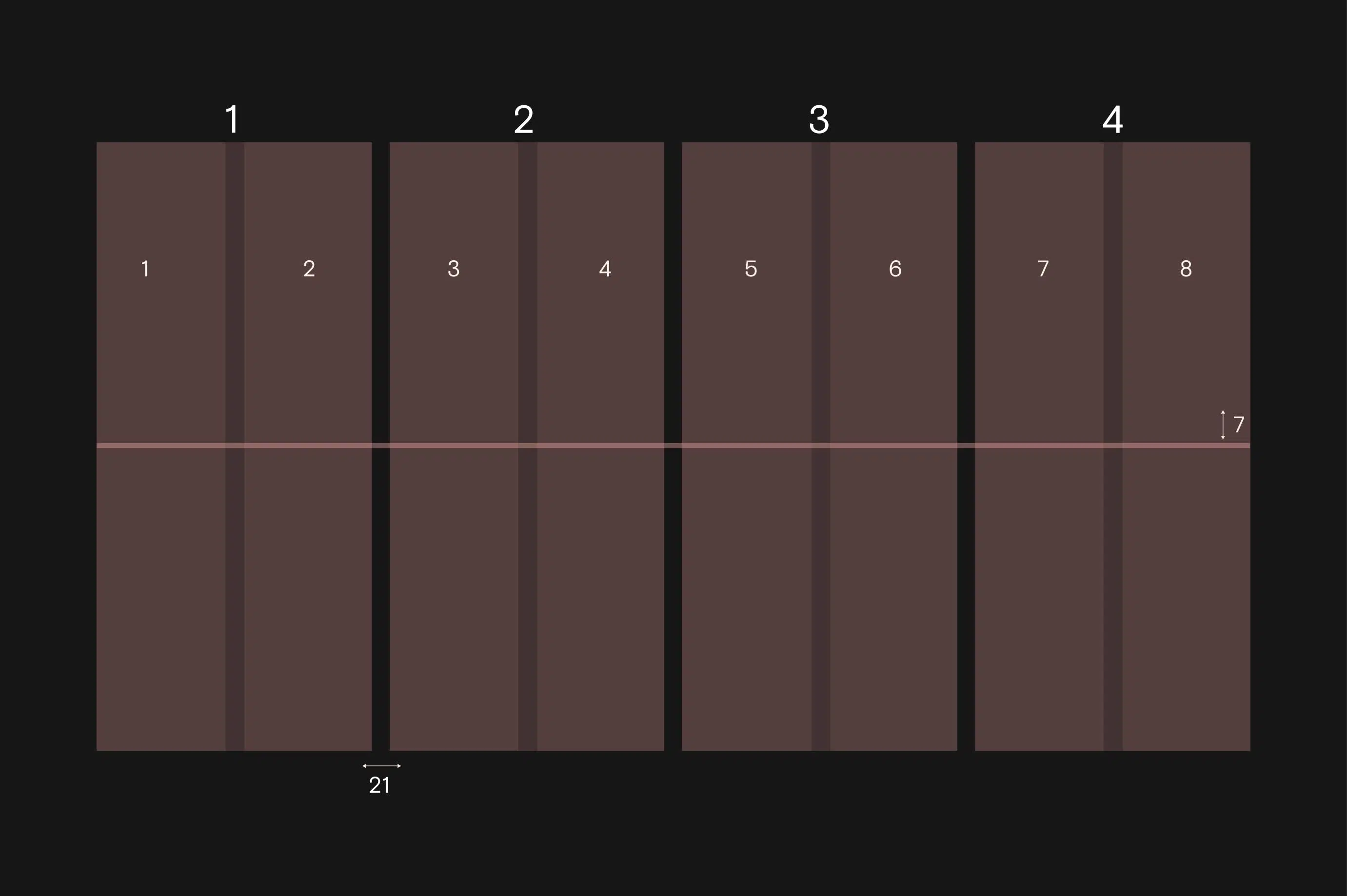
To connect the brand to breath work on an even deeper level, we used a 478 grid layout throughout the identity design - paying homage to the relaxing breathing technique where you inhale for 4 seconds, hold for 7, and exhale for 8.
Although this is not visible to consumers, it adds depth to the VANA brand story while creating consistency across all collateral.
When you breathe in, your lungs expand to accommodate incoming oxygen. And when you breathe out, your diaphragm and rib muscles relax - reducing the space in the chest cavity.
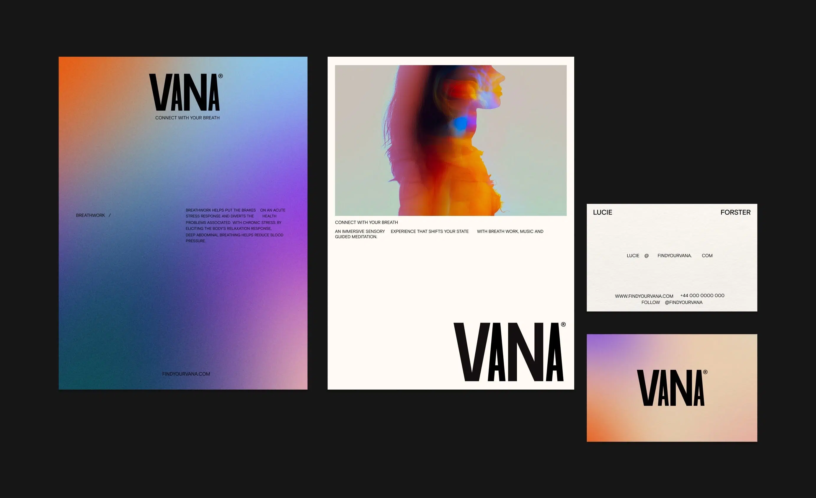
To translate this flow of breath in the wordmark, we played with the flexible widths of the typeface to create a sense of inhalation and exhalation. The result is a typographic showcase that delights with its bold shapes and playful interpretation.
The wordmark also plays its part in the intended tension of the overall identity - a strong masculine typeface set against the flowing movement of dreamy gradients and imagery.
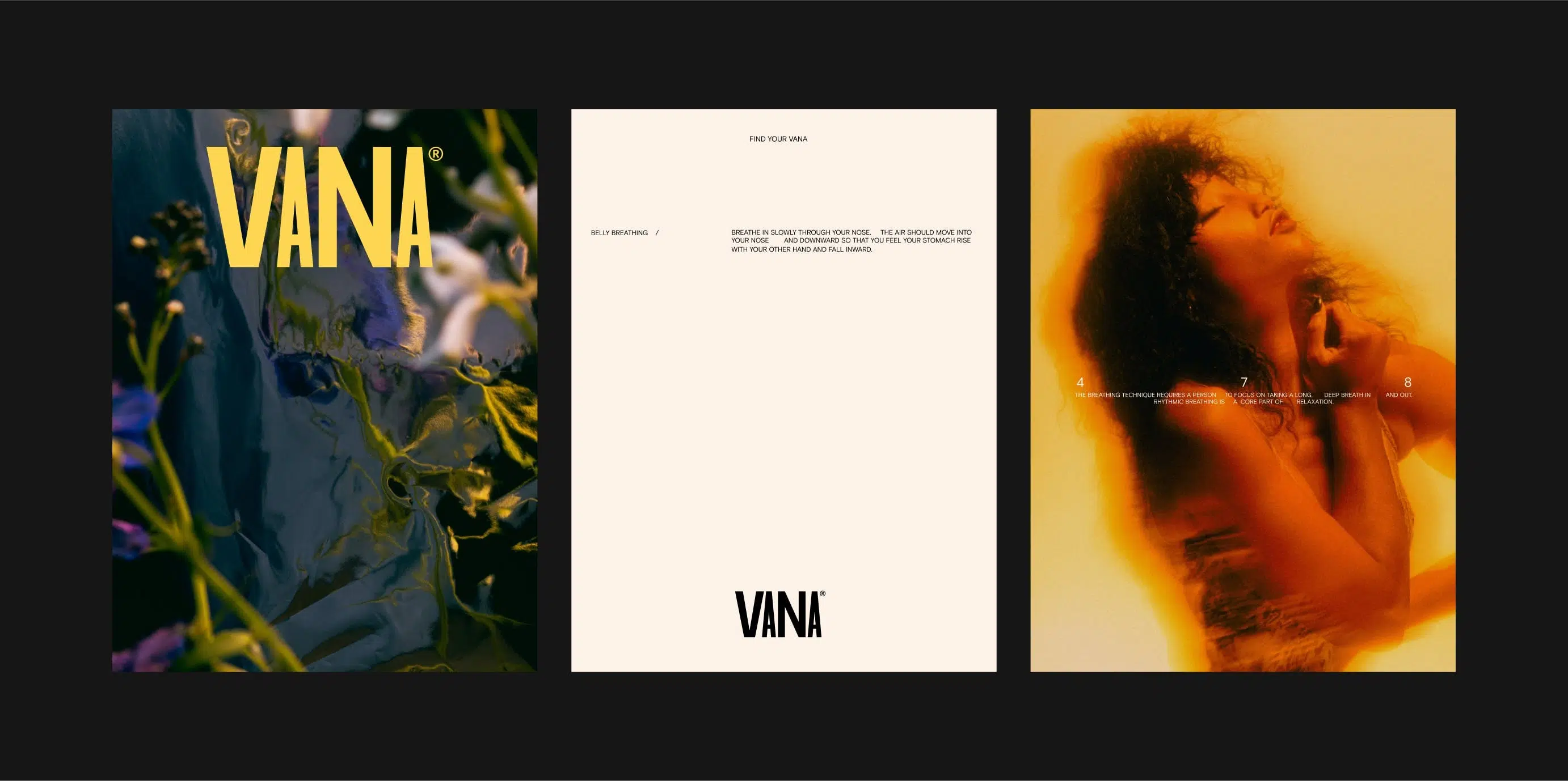
A dominant type treatment of the brand involved the use of space in sentences and headlines. This was accomplished by translating the 478 grid to the type treatment in layouts. The increased spaces in sentences are made to illustrate the calming breathing pattern of 4-7-8.
This brings a grounding structure to the identity through its straightforward sans serif construction and use of white space. It does so not only in the sentence structure and typesetting, but also in the overall composition - conveying the feeling that VANA provides space to breathe.
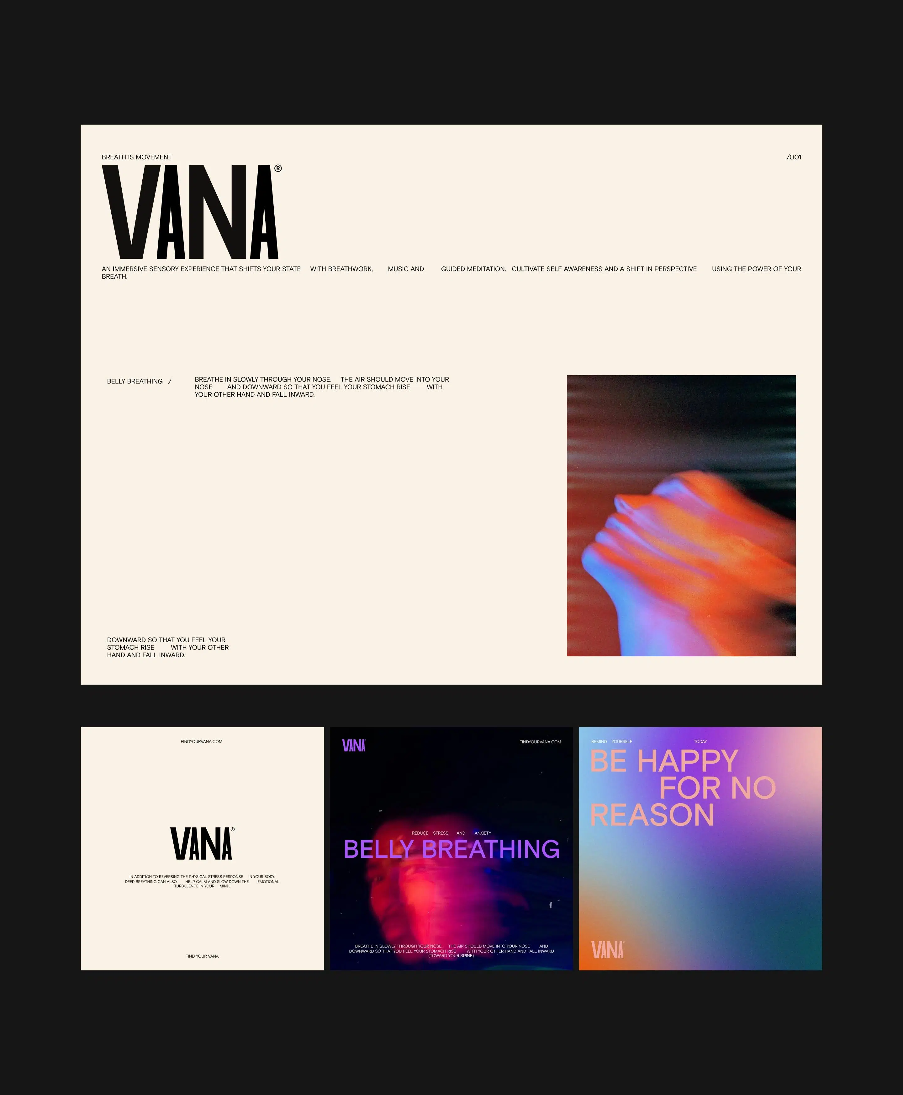
Art direction across the brand identity reflects the vibrance and energy felt through breath work. Most of the photography is cropped in or out of focus - interpretive of movement, energy, and flow. Deliberately chosen, this photographic style appeals to both mainstream and alternative audiences.


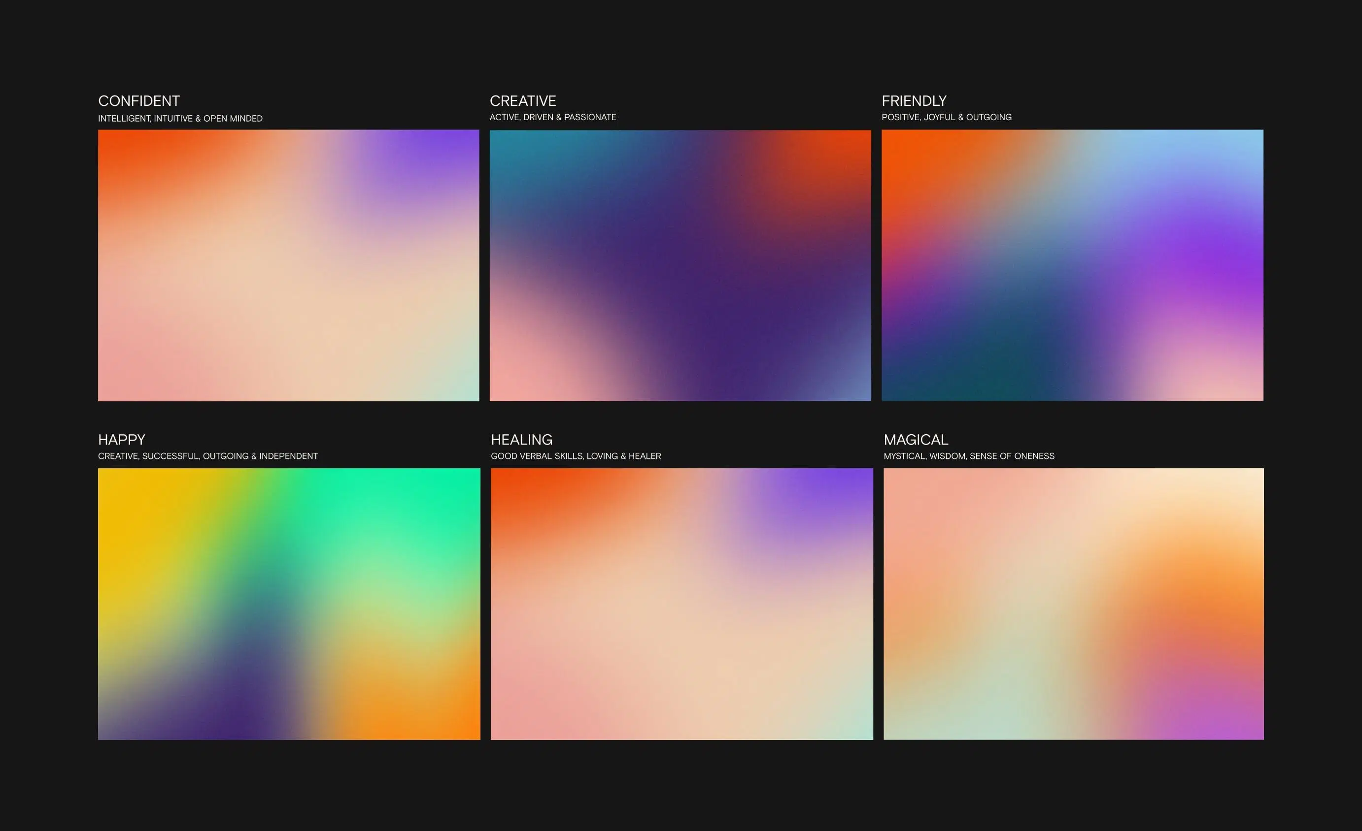
To emphasise the flow and movement of breath, we chose to create six different gradients. The vibrancy in colour speaks to the energetic nature of the brand and the importance of breath as life force.
The gradients are also representative of an aura or human energy field which are coloured emanations said to surround the human body. They also provide a sense of joy and spontaneity to the identity, particularly when in motion.
Scope of work
Research
- Customer Research
- Trends Analysis
- Competitor Review
- Best Practice Review
- Usability Research & Testing
- Market Research
Strategy
- Brand Positioning & Architecture
- Target Audience Discovery
- Customer Journey Mapping
- Feature Definition
- Information Architecture
- Usability Audit & Review
Design
- Art Direction
- Brand Identity Design
- Graphic Design
- Wireframing
- User Interface Design
- User Experience Design
- Interaction Design
- Motion Design
- Digital Product Design
- Design Systems
- Quality Assurance
Development
- Technical Strategy
- React / Next.js Development
- Cross-browser Testing
- Cross-device Testing
- SEO & Performance Optimisation
- Quality Assurance
Content
- SEO Copy Analysis & Refinement
- Thematic Keyword Research
- Social Media Design
- Content Management